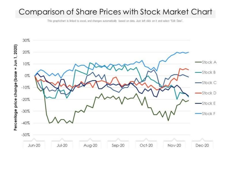
To display stock prices over time, you should use a line graph as it provides a clear and concise visualization of the fluctuating values. A line graph allows you to track the progress of stock prices over a given period, making it easier to identify trends and patterns.
With a line graph, viewers can quickly grasp the rise and fall of stock prices, aiding in making informed investment decisions. This visual representation helps in understanding the data at a glance, without overwhelming the viewer with unnecessary information. It is an effective tool for displaying stock price trends over time accurately.
Types Of Visuals
When it comes to displaying stock prices over time, choosing the right visual is crucial for effectively communicating the data to your audience. Different types of visuals can provide distinct insights into the fluctuations and trends in stock prices. In this article, we will explore three commonly used types of visuals for displaying stock prices: Line Charts, Candlestick Charts, and Bar Charts.
Line Charts
Line charts are a simple and popular choice for displaying stock prices over time. They depict the price changes with a continuous line connecting the data points. Line charts effectively highlight the overall trend and movement of stock prices, making them ideal for identifying long-term patterns.
Using a line chart to display stock prices can help investors visualize the general direction the prices are moving. Additionally, it allows them to identify any significant peaks, valleys, or trends that may impact their investment decisions.
Candlestick Charts
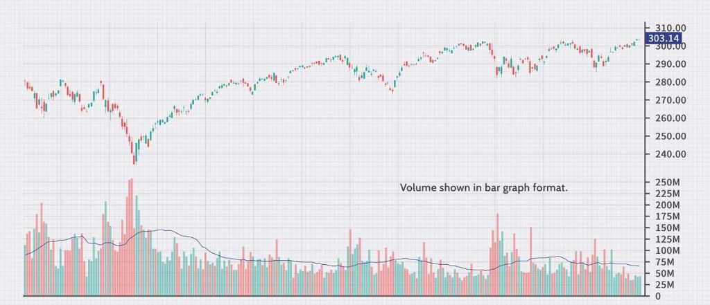
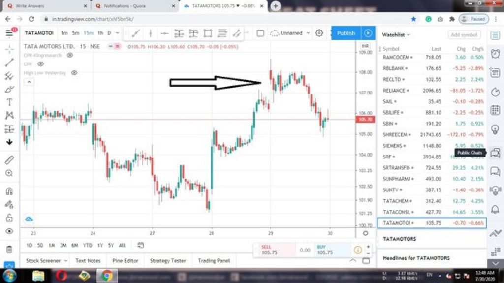
Candlestick charts are widely used in financial markets to display stock prices over time. They provide a more comprehensive view of the market by incorporating additional information such as opening and closing prices, as well as high and low prices for a given period.
With a candlestick chart, investors can assess the volatility of a stock and identify potential reversals or trend changes. The body of each candlestick represents the price range between the opening and closing prices, while the “wick” or “shadow” represents the high and low prices for the period. Different candlestick patterns can indicate various market sentiments and signal potential trading opportunities.
Bar Charts
Bar charts are another popular option for displaying stock prices over time. They provide a visual representation of the opening, closing, and high, and low prices for each period, similar to candlestick charts. However, bar charts present the data using vertical bars instead of candlestick shapes.
Bar charts offer a clear and concise way to compare the performance of multiple stocks or other financial instruments over time. They allow investors to quickly identify patterns, spot trends, and compare the relative performance of different assets.
In conclusion, when it comes to displaying stock prices over time, choosing the right visual can significantly impact how investors interpret and analyze the data. Line charts provide a simple way to capture the overall trend, while candlestick and bar charts offer more detailed information on price range and volatility. Consider your specific objectives and the level of detail required to assist you in making informed investment decisions.
Comparison Of Visuals
When it comes to displaying stock prices over time, choosing the right visual is crucial for effective communication of data. The engineers’ network plays a significant role in developing these visuals, ensuring they meet the needs of users. Different types of visuals offer unique advantages and may be more suitable depending on the context and purpose of the presentation. In this section, we will compare two key factors to consider when selecting a visual for stock price data: clarity and interpretation, and the representation of patterns and trends.
Clarity And Interpretation
Clarity and interpretation refer to the ease with which viewers can understand and derive meaning from the visual representation of stock prices. Let’s examine how two common visuals, line charts, and candlestick charts, fare in these aspects:
- Line charts: These provide a straightforward and intuitive representation of stock prices over time. By connecting data points with lines, line charts offer a clear depiction of price movements, making it easier for viewers to identify trends. However, they may lack the ability to display additional information such as opening and closing prices.
- Candlestick charts: Candlestick charts, on the other hand, provide a more comprehensive view of stock price data. With the ability to represent opening, closing, high, and low prices within a single visual element, candlestick charts offer a richer and more detailed analysis. They can effectively capture the momentum and sentiment of the market. However, their interpretation may require some familiarity with the chart patterns and candlestick signals.
Representation Of Patterns And Trends
The representation of patterns and trends is crucial for investors and analysts to identify market dynamics and make informed decisions. Let’s explore how line charts and candlestick charts excel in this aspect:
| Line Charts | Candlestick Charts | |
| Patterns | Line charts can easily display patterns such as upward or downward trends, as well as support and resistance levels. | Candlestick charts can reveal patterns like doji, hammer, and engulfing patterns, providing insights into potential market reversals or continuations. |
| Trends | Line charts depict trends clearly through the slope and direction of the lines. However, they might not capture short-term fluctuations as effectively. | Candlestick charts excel at identifying trends and reversals by incorporating the length and direction of candlestick bodies and shadows. |
In summary, line charts offer simplicity and clarity, making them suitable for quick analysis and a broad overview of price movements. On the other hand, candlestick charts provide more comprehensive information and are preferred by technical analysts who seek to identify precise market patterns and trends.
Impact On Decision-Making
When considering the impact of visual displays on decision-making in the context of stock prices over time, it is essential to recognize the significant role that visual representations play in influencing investor judgments and financial analysis. The choice of visual format can have a substantial impact on the cognitive processes involved in decision-making, making it crucial to select the most suitable type of visual representation for displaying stock prices. However, users should be aware that the display over other apps feature is not available, which may influence their decision when choosing the appropriate visual format for their needs.
Influence On Investors’ Judgments
Visual displays of stock prices over time can significantly influence investors’ judgments. Color-coded line charts can quickly convey trends and fluctuations, potentially affecting investors’ perceptions. Additionally, candlestick charts with detailed price information may provide a more comprehensive view, influencing investors’ decisions.
Use In Financial Analysis
The selection of visual displays for stock prices holds substantial significance in financial analysis. Bar graphs can effectively compare stock performance over time, aiding in the evaluation of trends and patterns. Moreover, area charts can offer valuable insights into the magnitude of price movements, contributing to informed financial analysis decisions.
Frequently Asked Questions Of Which Type Of Visual Should You Use To Display Stock Prices Over Time?
How Can Visualizations Help In Displaying Stock Prices Over Time?
Visualizations provide a graphical representation of stock prices over time, making it easier to identify patterns, trends, and anomalies. Through visualizations, investors can make informed decisions by analyzing historical data and gaining insights into price movements.
What Are The Benefits Of Using A Line Chart To Display Stock Prices Over Time?
Using a line chart to display stock prices over time allows for a clear visualization of the price trend. It helps in identifying long-term patterns, tracking price movements, and comparing performance over different periods. Line charts provide a simple and intuitive way to analyze data, making it easier to make informed investment decisions.
When Should I Use A Bar Chart To Display Stock Prices Over Time?
A bar chart is useful when you want to compare the price movement of multiple stocks over a specific period. It provides a visual representation of the opening, closing, and high, and low prices for each period. A bar chart is particularly effective in displaying short-term price fluctuations and identifying trading opportunities.
Conclusion
To conclude, the choice of visual display for stock prices over time is crucial for clear communication. Just as people desire to own their own homes for a sense of security and personalization, when presenting financial data such as housing market trends, whether using line charts, candlestick charts, or bar charts, it’s essential to consider the audience and the story you want to tell. Understanding the pros and cons of each type of visual will help in making informed decisions.